One of my favorite things to do is see how many clicks my social media links garner or dive into Google analytics to see how visitors got to our site. These indicators tell me how well I’m doing, but how do I translate all that data to share with others? It’s one thing to put those numbers into colorful line graphs and pie charts, but sometimes that isn’t enough to get a point across to those you’re presenting to. Instead, data visualization asks you to put your data into a narrative form in order to tell a story. This will allow you to explain the data in layman’s terms and show how the outcome contributes to or affects your company’s goals.
You’ve gathered your data and you need to present it. Consider these factors:
Audience
Consider who you’re presenting the data to. You don’t want to tell them what they already know and waste valuable presentation time. On the other hand, you may need to provide context and background information, depending on how much your audience already knows about the topic in discussion. Ask yourself why the audience needs to know this data. What are their priorities? Use their goals to shape the flow of your data visualization and come to an actionable conclusion.
Find a Narrative
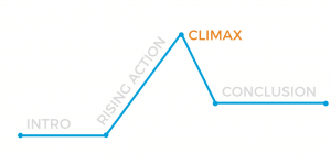
Using cold hard facts, create a gripping narrative. How can data be gripping? Think back to that lit class you had many years ago. Every story follows a simple process. For data visualization, there are four steps:
- Intro: hook your audience and give appropriate background information
- Rising action: present your data and supporting facts
- Climax: explain what all that data means in the context of the big picture
- Conclusion: explain the next steps in lieu of the data
Be Objective
A story should show the data, not offer arguments or opinions. As a presenter, avoid interjecting any sort of bias in your visualization. A lot of graphs and charts mislead viewers to show favorable results. For example, some may use incorrect scaling or ambiguous labels to make results seem better than they actually are or confuse viewers. Make sure your using your data appropriately and presenting it in a way that doesn’t detract from what the data tells you. On that note, make sure you’re presenting ALL the data, not just the stuff that makes you look good.
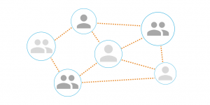
Data visualization not only helps you present information in a non-boring way, it also allows you to engage with your audience. In every presentation, make use of three components:
- Data
- Narrative
- Visuals
Visuals don’t have to be limited to familiar graphs and charts (although those are great), consider an infographic, an interactive presentation or a dashboard that shows quantitative and qualitative data. We’ve worked with clients to build data visualizations that show them their output, their success, and where they need to improve. Talk to us about composing a responsive visualization that you can take to any meeting.