Having a good website is crucial in this day in age to your business. Millions of companies have their own unique websites with different formats and plug-ins. There is no magic formula for creating the best website BUT there are universal things that can stop websites from reaching their full potential. Here are six simple website mistakes to avoid.
1. Pop-Ups
Everyone has experienced the anger of the pop up. You are scrolling through your favorite online shopping site and then, boom, “20% of all Ugg Boots” pops up. Yes, It is pointless. It is summer, I don’t need my Ugg boots now. Pop-up ads are a pain, but useful pop-ups asking readers to share a post, follow on social media, or join a mailing list are just as aggravating. Instead, tastefully and strategically place these links on the perimeter of the page.
2. Too Much Going On
When novice website builders get their hands on all of the wonderful website building tools of the interweb, they become mesmerized by the thousands of different fonts, colors, styles, and just general visual options. Why not try them all, five fonts, six colors, two different formats on one page…kind of like a sampler plate at your favorite barbecue restaurant. Too many different things happening on one page confuses the user and overcomplicates the site. Instead it is best to keep it to two or three colors, one style, and at most two or three fonts per page to give your company the solid reliable look.
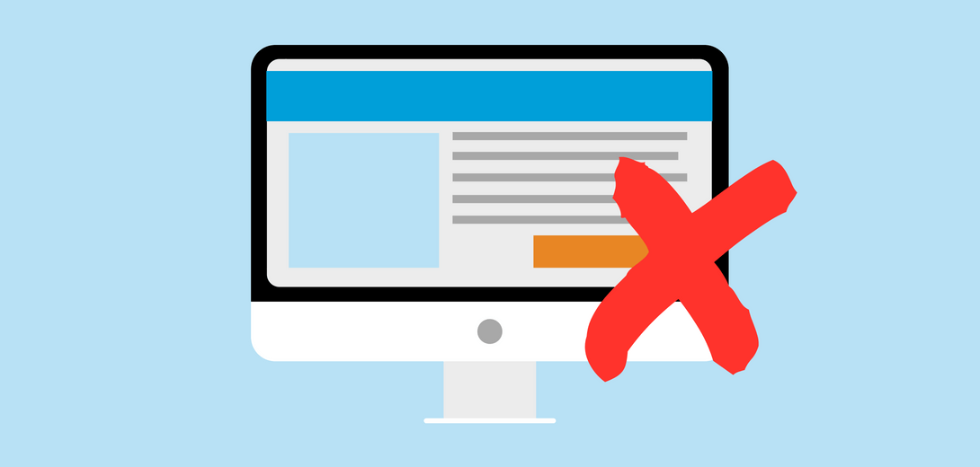
3. Orphan Pages
In web hosting orphan pages, are pages where a user does not know where to go next. At that point they just abandon the site and click the always feared red x button. A good way to protect against this is to put a homepage link on every page. This can be in linkstyle form with the word homepage on a toolbar or a simple site logo that when clicked links back to the homepage. This is supremely important when links are shared via social media or email and the page does not have a link to the rest of the site. The user can’t hit the back button and is now stuck on that page island with no link back to the rest of your site.
4. Mobile Display Problems
In an always changing world, more and more people are going to be viewing your site from a mobile platform. Tablets, smartphones, and even smart watches are the wave of the future. If your site is not compatible or even does not look as pristine as it does on its full site you could lose out on more than half of your website traffic.
5. Forgetting to Link Your Social Media Sites
Contrary to some beliefs, social media is here to stay. Most businesses have Facebook and Twitter pages, Linkedin Profiles, and of course the old school email blast. Once people are on your site, you want to keep them in the loop. Allow your customers an easy way to follow your business’ news with a simple Twitter or Facebook link, usually located towards the bottom of the site.
6. Outdated Information:
This last tip may seem obvious, but if you haven’t updated your site in a while chances are you have some information that used to be important but now is frivolous or even wrong. As a reader, seeing outdated information is a major turnoff and shows that your company has a lack of attention to detail. Next stop… a competitor’s site.
If your website is not producing the results you want, there is a good chance it’s as a result of a simple mistake. Make sure to always QA check your website on a regular basis and your website will be well on its way to being your company’s top salesman.

